Cleaning, analysis and contextualizing the available data
When we received the NEERI data, we were excited to start analyzing and wrote a few blogposts about the water quality of two cities; Chennai and Jaipur. Although the data was old and was not very useful in terms of actually telling people about their water supply, it was for the first time that we had seen such an extensive dataset on urban water, from reservoir to consumer, and by seasons namely summer, monsoon, and winter.
We thought that this was a good opportunity to use this data to build a visual that could be informative and flexible enough to put more updated water quality information on it when it was available.
We thought that it was important to put water quality information in the context of how the water flowed through the city. For this, we decided to create an urban water system map and overlay the water quality data on top of it. This made it necessary to create a good reference map over which the data for water quality could be traced.
Excessive details such as the road network of the city, or landmarks such as parks and important buildings that helped orient the reader, needed to be weeded out as they made it harder for the water infrastructure to be mapped with the desired clarity. However, since the data was closely linked with different locations around the city, it was necessary for the visualisation to retain some geographical relevance.
Creation of maps
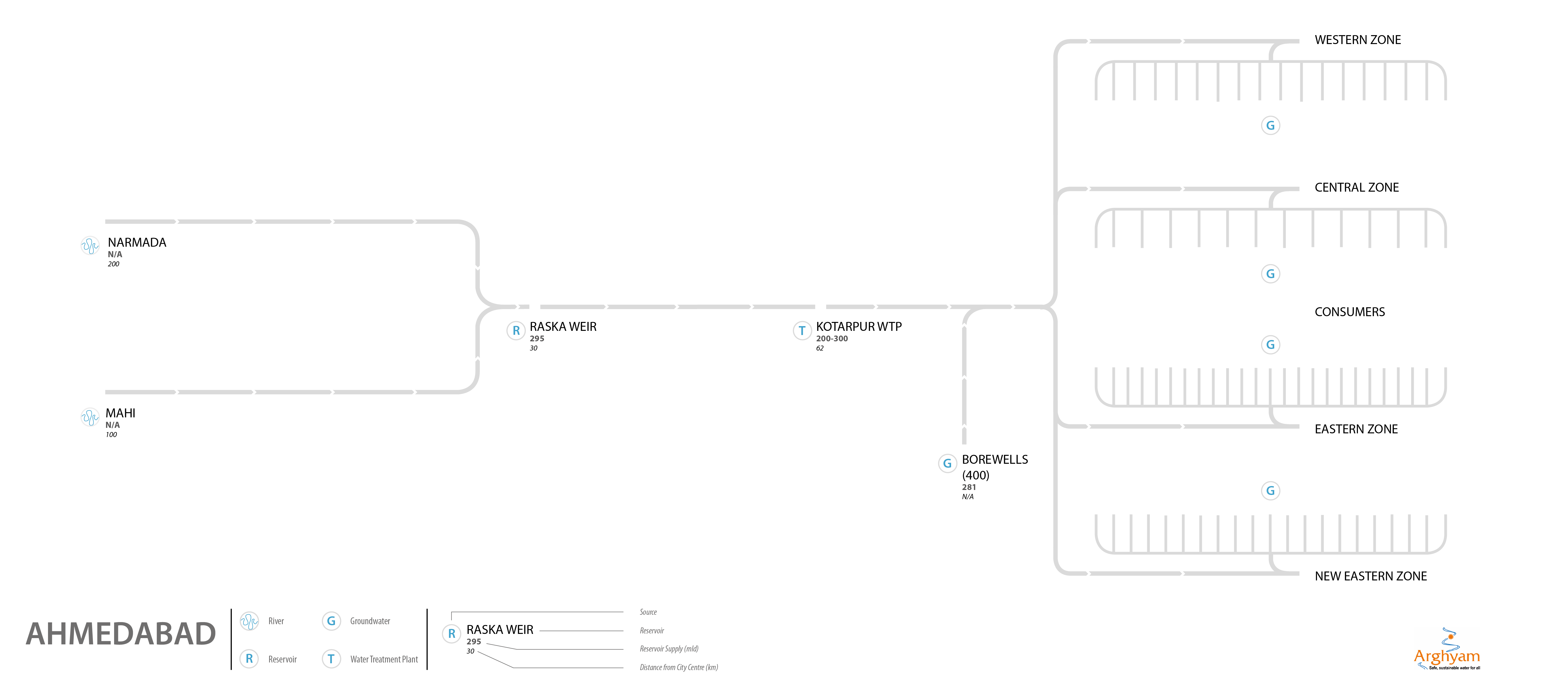
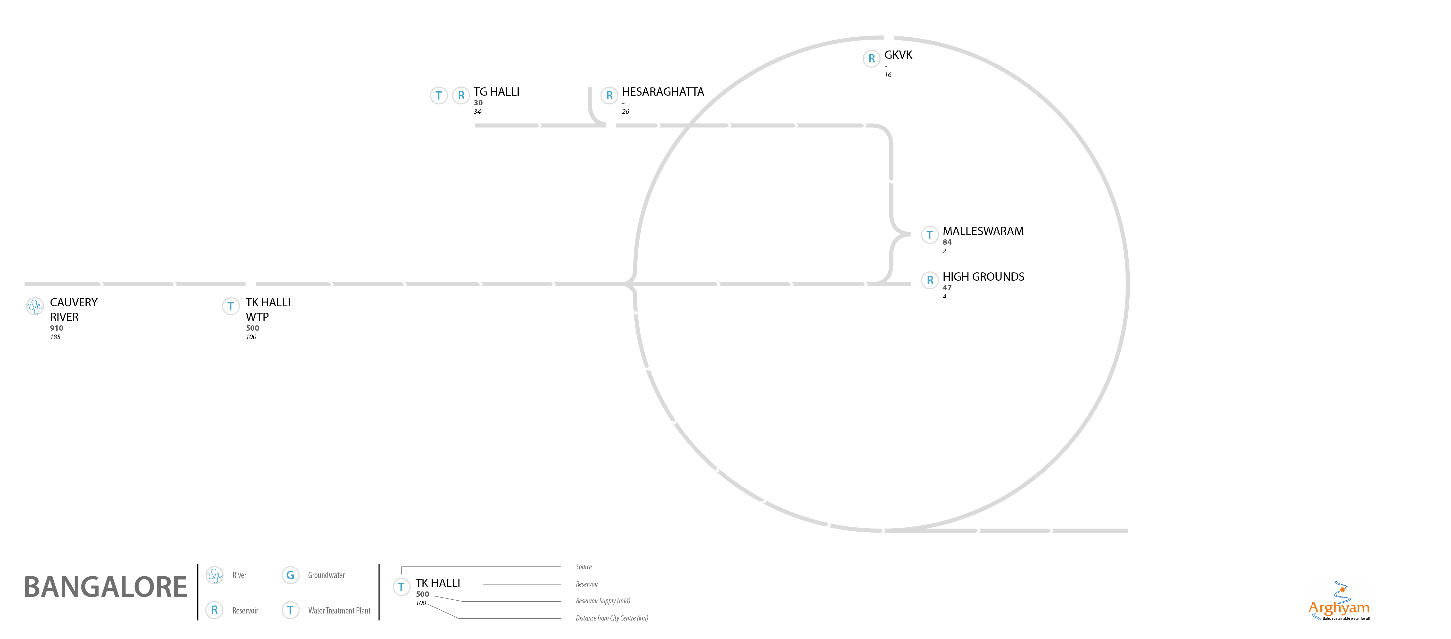
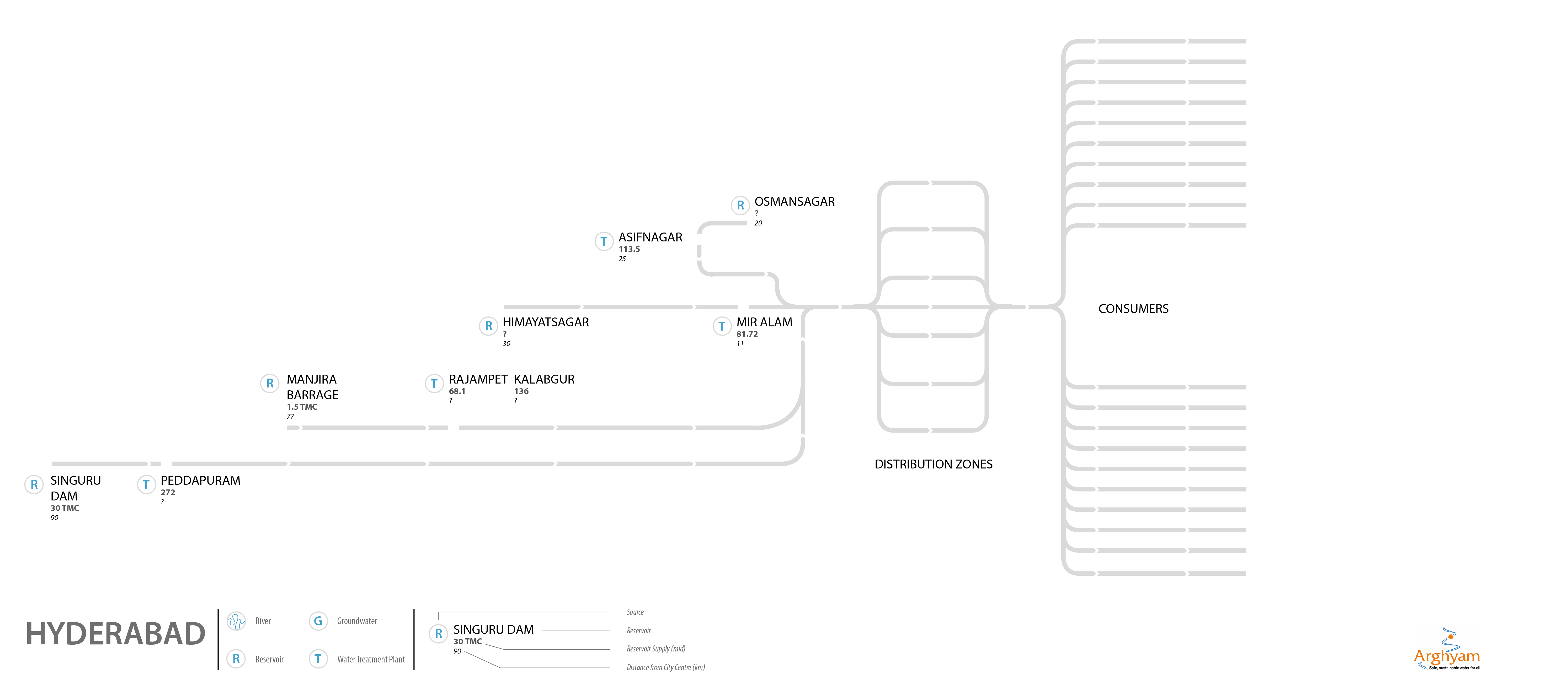
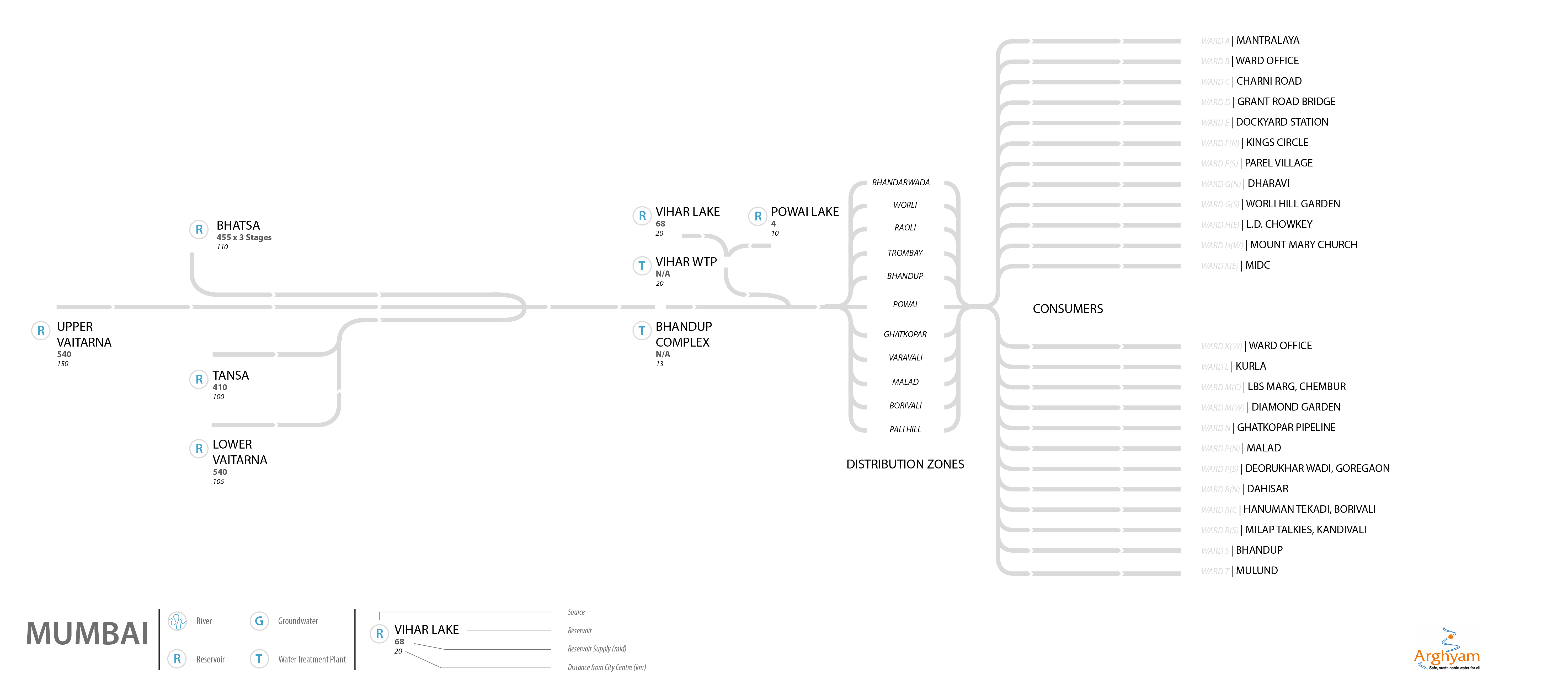
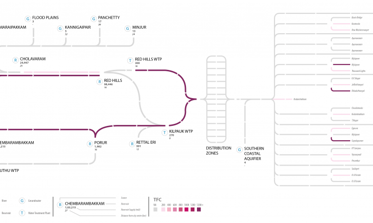
Tejas Pande, the designer, started looking at the data. The maps produced consisted of various water bodies that made up the water supply infrastructure of the city such as reservoirs, lakes, treatment plants, tanks, and so on. Each body was connected to the successive one in the supply chain by a line. This line represented the quality of water flowing from the former body to the latter, using a coloured key. The darker the colour, the higher the contamination.
Arrows in white, running along the lines, helped trace the flow of the water. If a line was found grey in colour, that meant that data for that section was not available. The source of water, which was predominantly surface or ground, was denoted alongside the name of every reservoir. Also, under the name of the reservoir, its capacity (volume) and its distance from the centre of the city was labelled.
All these details can be clearly seen below in the Chennai maps that we created since Chennai had the most complete and organized data that helped in building a map that was fairly extensive.
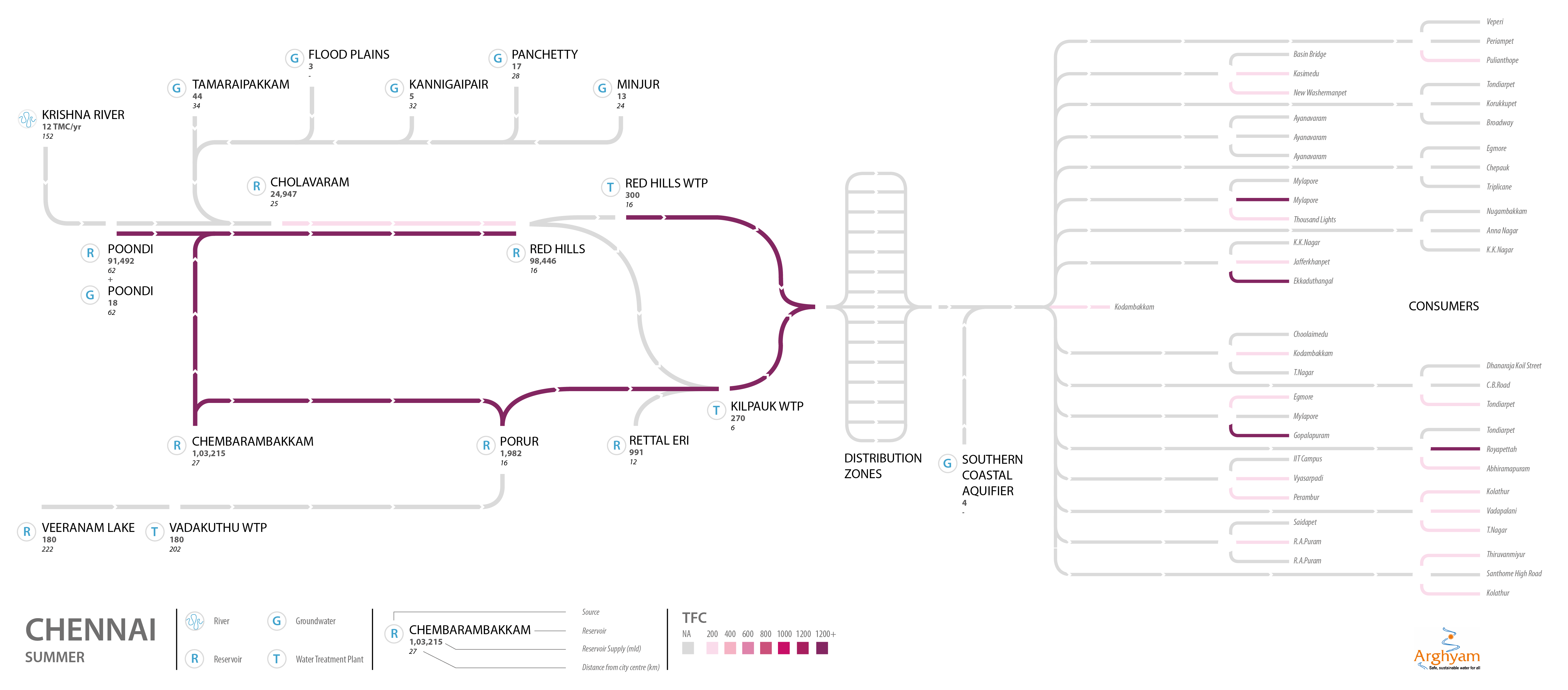
The maps were designed to be very simple so as to make it easy for the reader to engage with them and have a conversation about the data and its revelations, be it the state of the water one consumed or the data that evaluated it.
Limitations faced while creating maps
The glaring lack of data became increasingly apparent once the mapping began. Putting together such a map was riddled with problems of availability and accuracy of data.
While we went through the different cities, the quality of data and availability of information was found to be consistently inconsistent. There were instances where maps were available, but we could not always decipher how the system was connecting to each other. There were multiple versions of how these systems looked. It became a struggle to find basic components of some of the cities. We attempted New Delhi and found it to be too difficult.
We plan to create more base maps for cities and hope to complete them with participation and inputs from organizations and citizens in these cities who can add components and get more sources.
Please view the city maps below and get the methodology and how we did it by clicking on the city below.
/articles/urban-water-supply-maps
