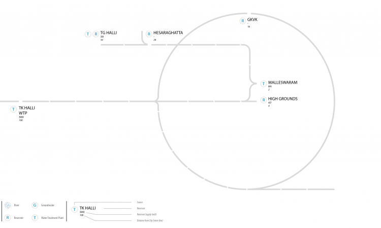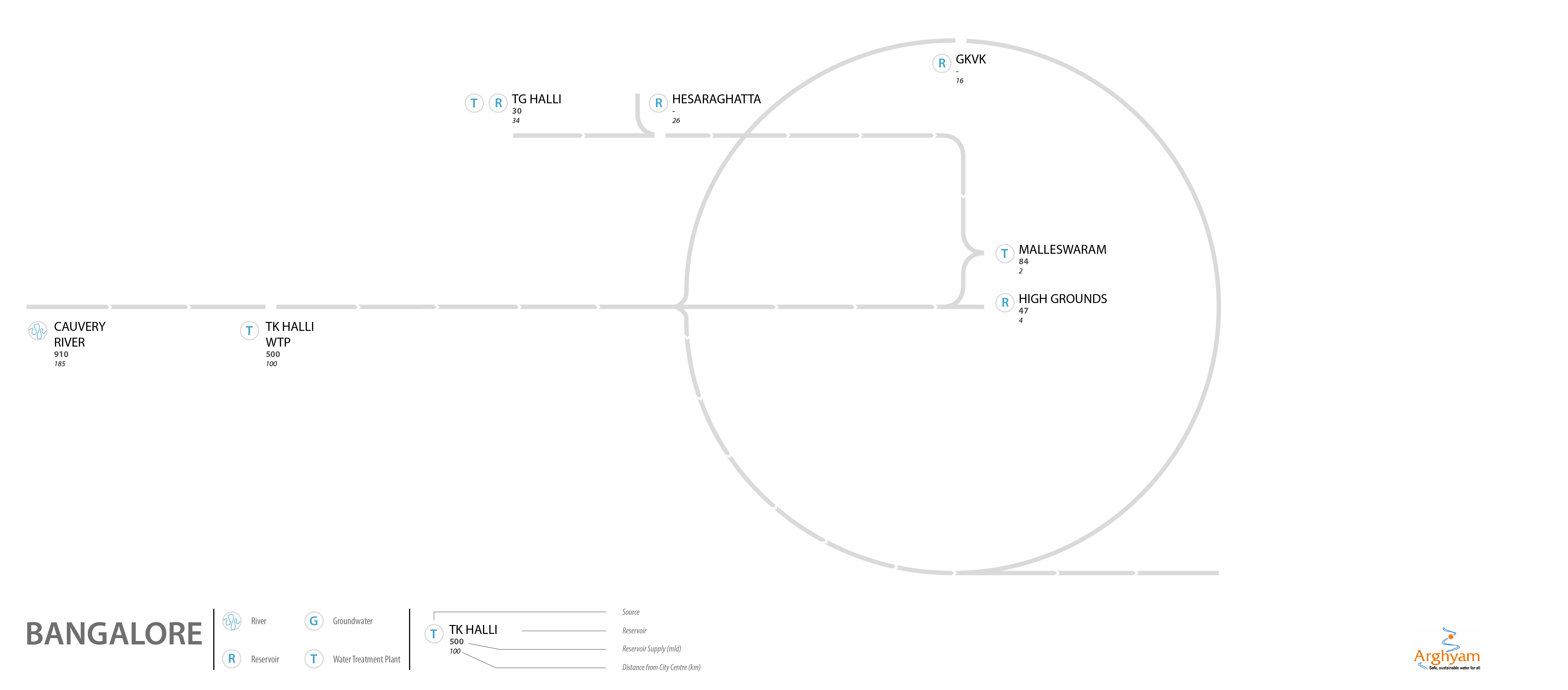
The construction of a visual map of water supply to Bangalore city from available data sets on water quality and water related infrastructure by NEERI as a part of the data project started by India Water Portal, Arghyam was a challenging task.
The visualisation process
The representation of the datasets to construct the visual map needed to bring together data related to the water quality of the city, mapped over its existing infrastructure. It needed to present relationships between the various stages of water flowing from source to the taps inside the homes. Such a visualisation of data would require it to be laid onto a system map, so that it would be easy to plot the movement of water from one stage to another. While a map of the water supply system was found with relative ease, it was surprisingly illegible and filled with details of very little relevance. Also, since these maps did not carry a time stamp, it was often very difficult to verify the information they presented.
The need for a Bangalore base map
This made it necessary to create a good reference map over which the data for water quality could be traced. Excessive details such as the road network of the city, or landmarks such as parks and important buildings that help orient the reader, needed to be weeded out as they made it harder for the water infrastructure to be mapped with desired clarity. However, since the data was closely-linked with different locations around the city, it was necessary for the visualisation to some retain geographical relevance. The maps produced consisted of various water bodies that made up the water supply infrastructure of the city such as reservoirs, lakes, treatment plants, tanks, and so on.

Visualisation of the data
The visualisation for Bangalore was produced using the combined sources of a series of maps published by Bangalore Water and Sewage Service Board (BWSSB) on their website, an academic paper (author unknown), and a presentation on water supply for Bangalore (author unknown) sourced from within the Arghyam network (Shubham Singh and Kavita Nath). A piece authored by Gaurav Gupta for the New Indian Express titled ‘Will Cauvery Quench the Thirst of Bangalore?’ dated 31st October, 2012, was referenced significantly, as well. The flow of water within the city posed some challenges as the distribution network was found to be non-linear and inconclusive in reference documents.
Methodology
The visualisations were produced using information primarily from the reports produced by NEERI (National Environmental Engineering Research Institute) and a sense of relative proximity in representation of the various elements that made up the water systems of the chosen cities. The information provided by the reports was further corroborated with additional sources such as water governance boards and government reports, and changes were made accordingly. The maps also needed to incorporate information on distances and the paths traced between various bodies of infrastructure. The details have been expanded upon in the text below:
NEERI reports
The reports produced by NEERI served as a point of departure for the visualizations. The structure of the report generally followed as noted below:
- Introduction to the city
- Sources of its raw water, path to the treatment facilities, and distribution of treated water
- Water treatment plants, the processes they deploy, and staffing composition
- Sewage treatment as well as dry waste management.
The information from across the report provided the base with which the framework for the visualisation was built. Every water body and treatment facility was identified before connecting the appropriate units to each other. This also included mapping out the unique distribution system for every city.
Additional Sources
The research undertaken by NEERI for the reports predated the projects proposed and implemented with funds from the JnNURM (Jawaharlal Nehru Urban Renewal Mission). CDP’s (Comprehensive Development Plans) were produced for the same. The CDP’s, thus, formed another source of information to supplement the original NEERI reports. Many water treatment and distribution boards also had some information relevant on their website, which was mostly in the form of maps that were found quite useful, as well. In some instances, academic papers were also referred to.
Google Maps-based distance calculators
Once the basic structure was constructed, the relative distances were mapped approximately on the diagram. However, certain liberties were necessitated to communicate scale and the intricacies of the systems. A large number of reservoirs/treatment plans/dams had been mentioned in the report without making clear how far they were from the city. Distance calculators were used to approximate distances from the city’s centre.
Limitations faced while constructing maps
While the set of NEERI reports covered extensive ground in most cases, it also revealed inadequacies in information provided when corroborated with other/recently updated sources. More importantly, although the reports followed a structure in presenting their findings, the level of information within each section varied from city to city. This made it difficult, at times, to work with the report.
The maps were designed to be very simple so that they engaged the reader to have a conversation about the data and its revelations, be it the state of the water one consumed or the data that evaluated it. The glaring lack of data became increasingly apparent once the mapping began. Thus, putting together such a map was also riddled with problems of availability and accuracy of data.
/articles/mapping-bangalores-water-supply